Typography Projects
-
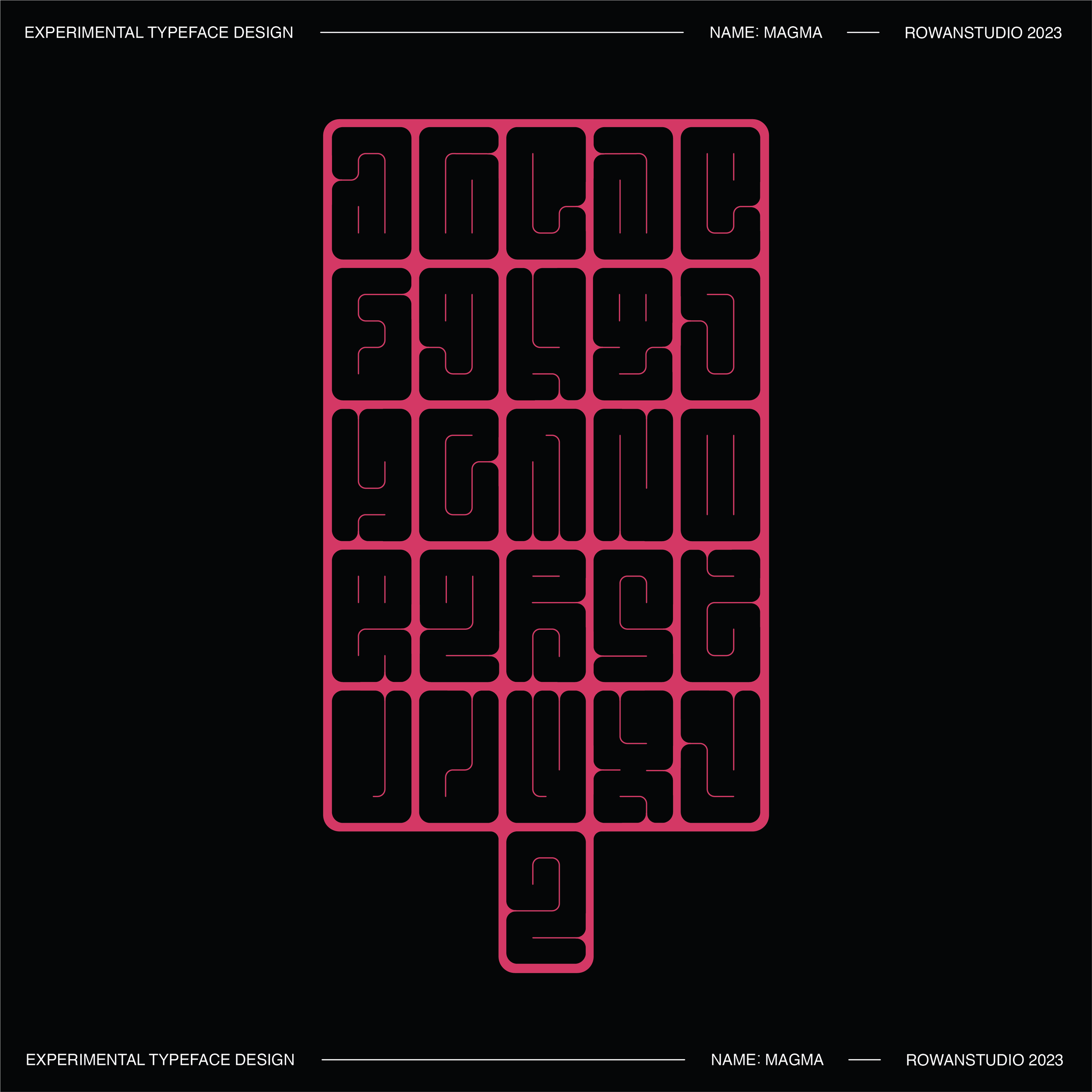
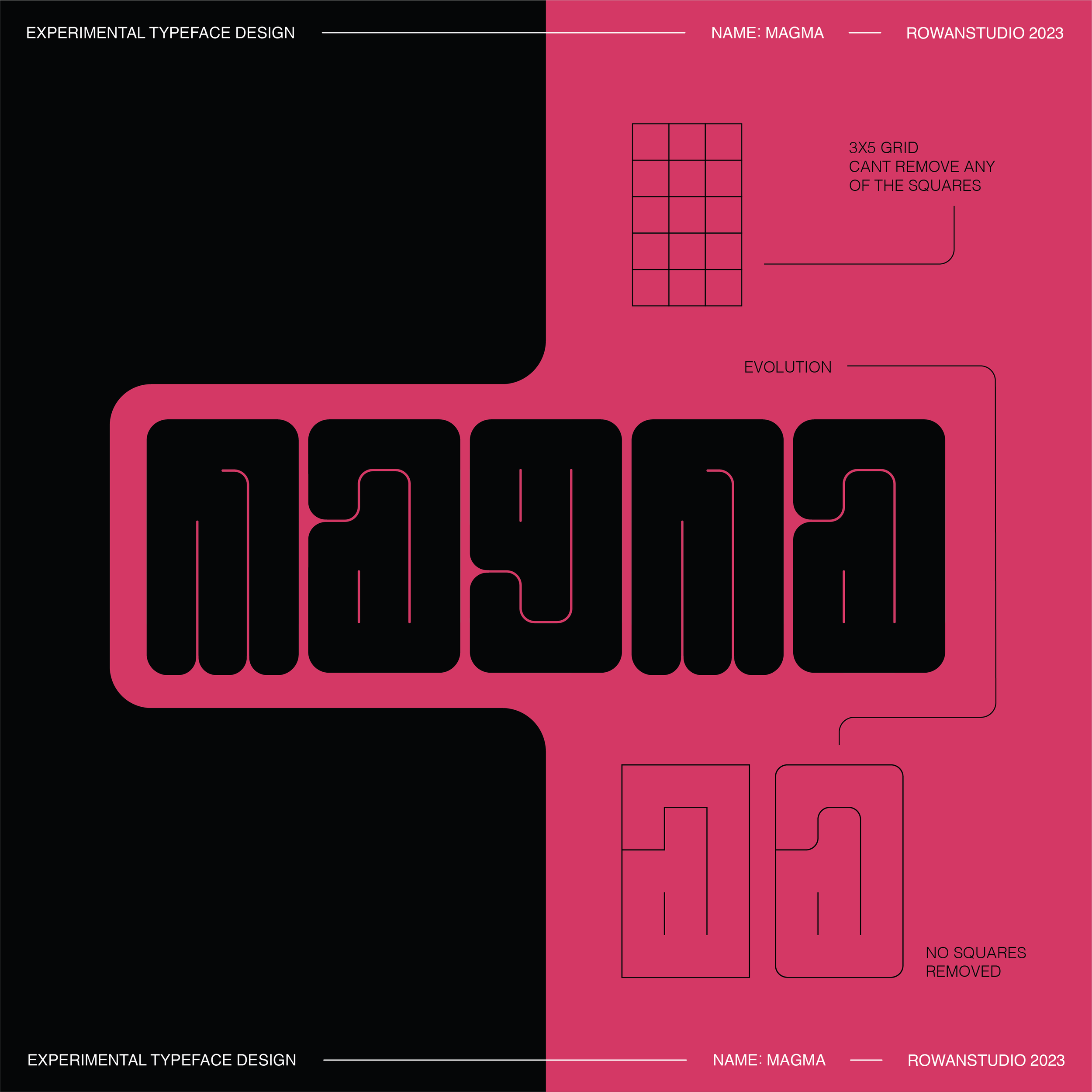
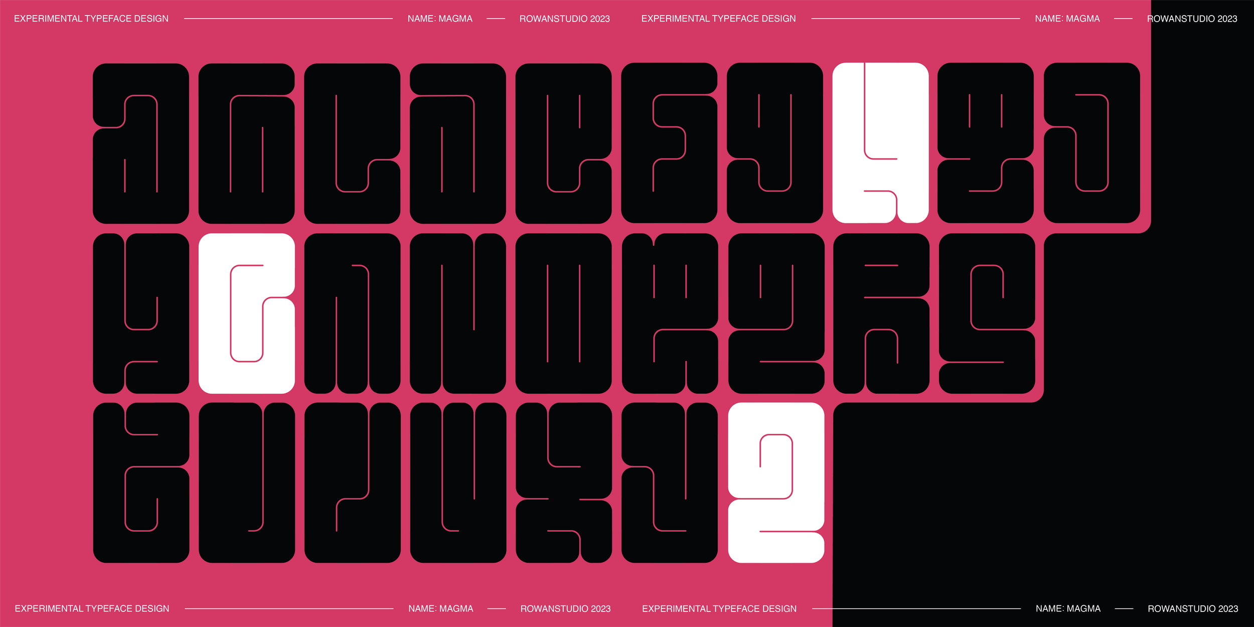
This was a personal project that grew from an animated piece I created during my “Poster a Day” challenge for instagram. I gave myself creative restrictions in terms of the design rules for this font. I was not allowed to remove any of the 15 squares in the grid for each letter. This restriction resulted in the squished and contorted look to all my letters resulting in an alphabet unlike any other.
-
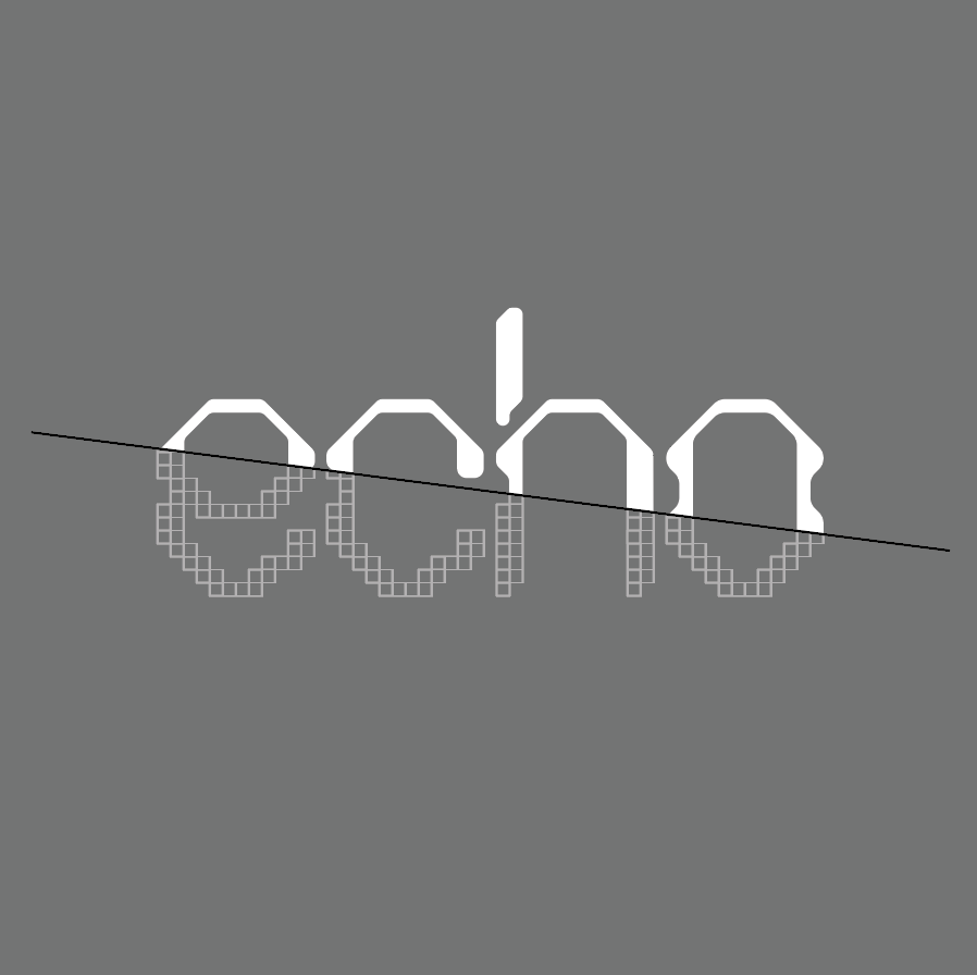
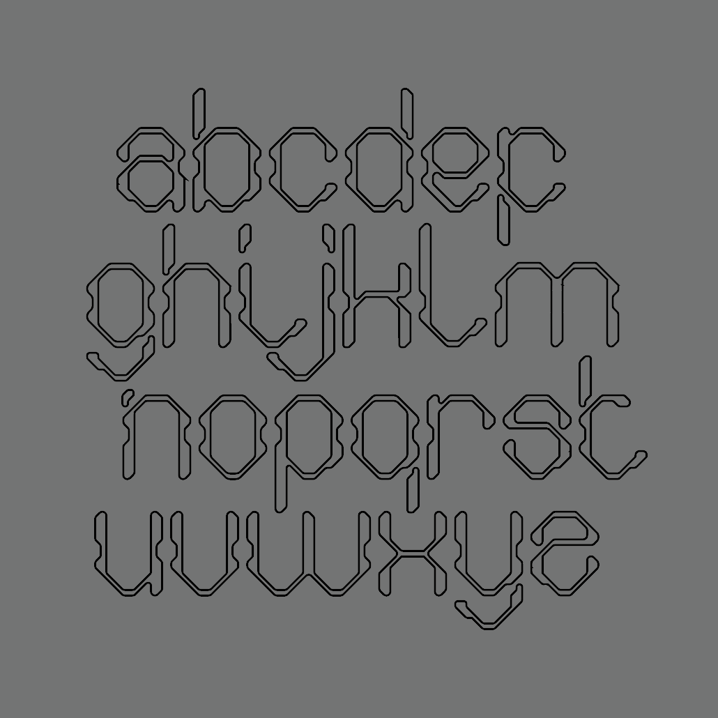
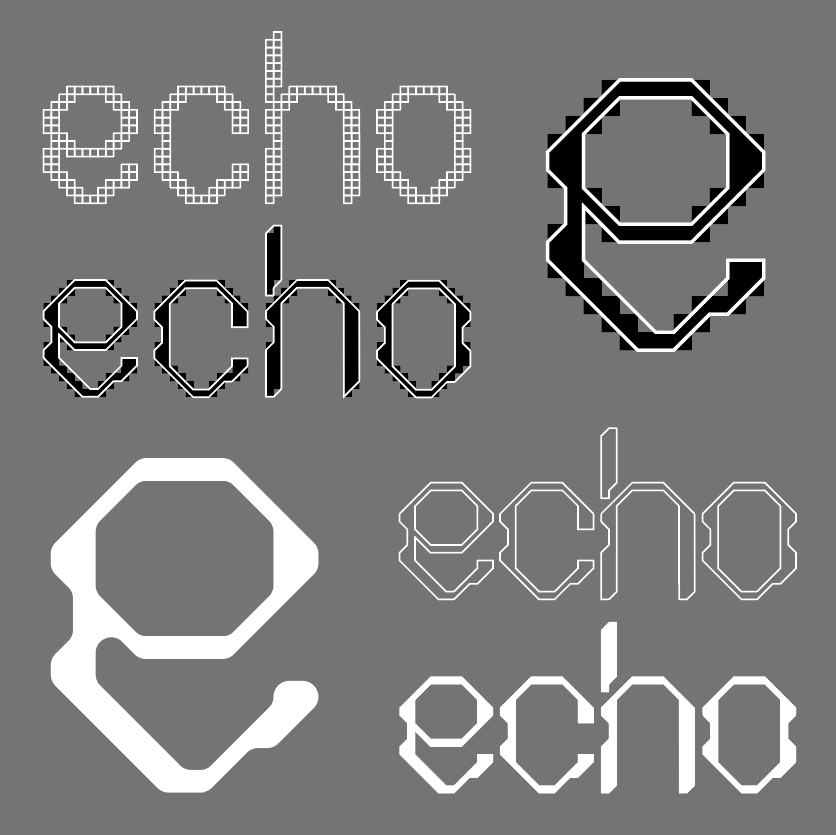
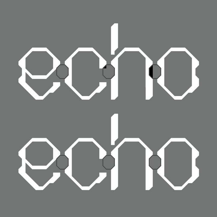
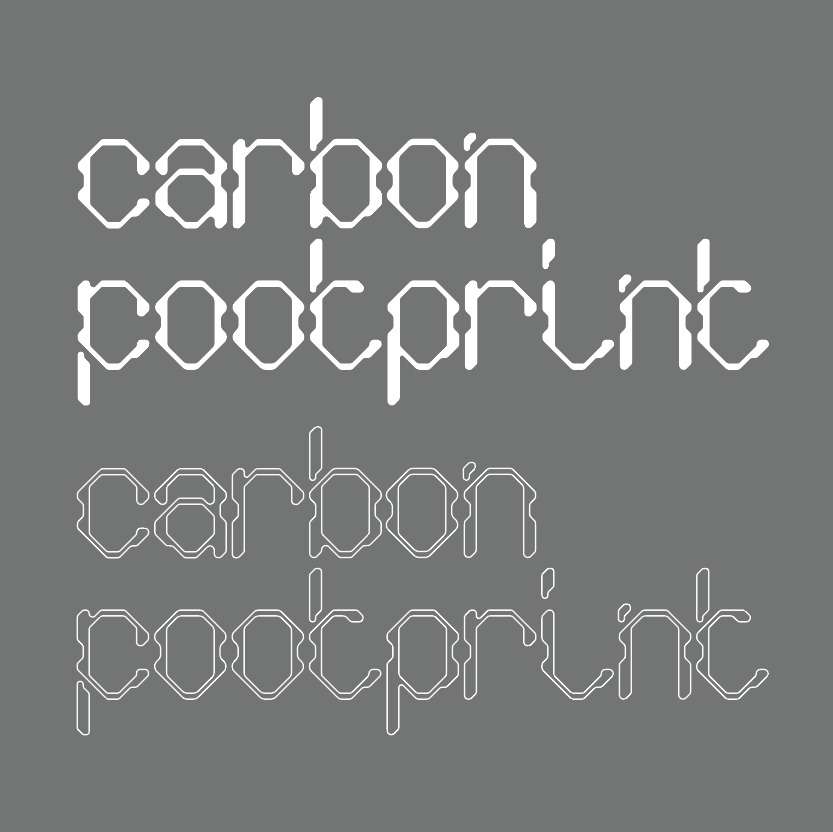
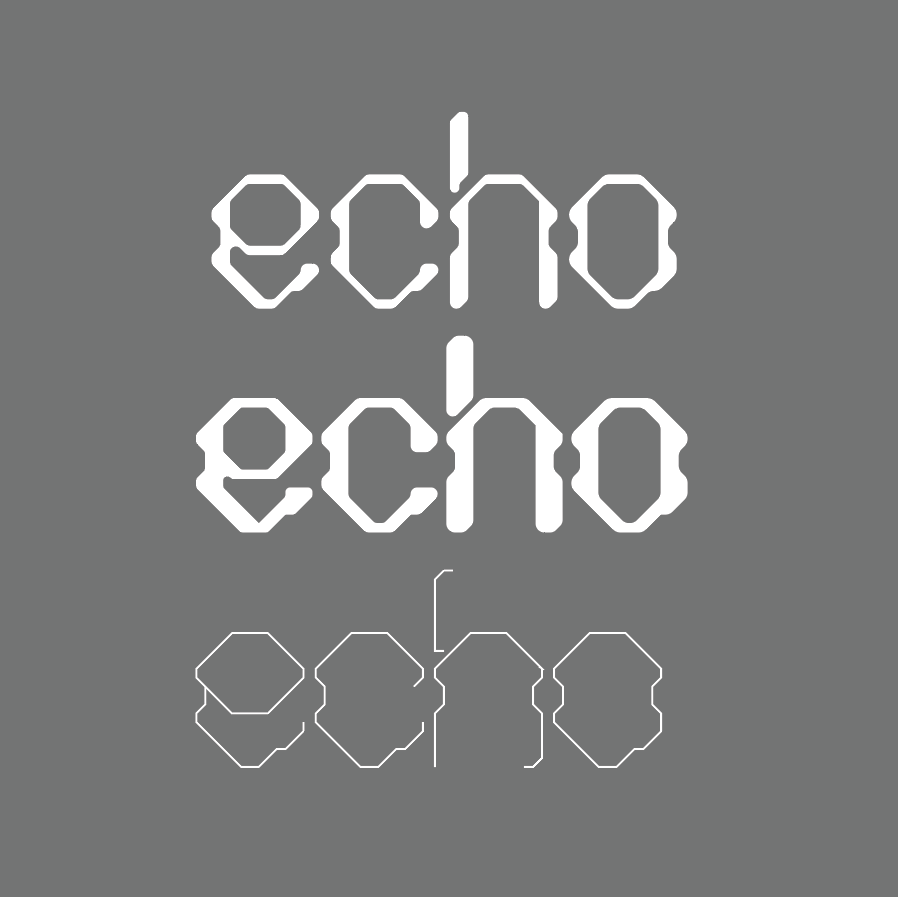
This design was inspired by research on the topic of electrical vehicles and how the form and design of these eco friendly cars have evolved over time into more streamlined and futuristic shapes. The initial type face created during the project was very modular. This was then used as a frame to evolve and cut down the typeface matching the design process of these vehicles. Scroll down to see the evolution of this typeface and how it came to be…
-
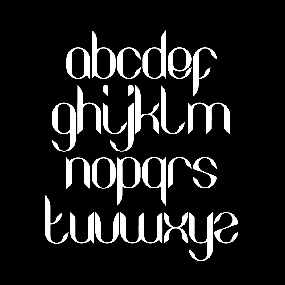
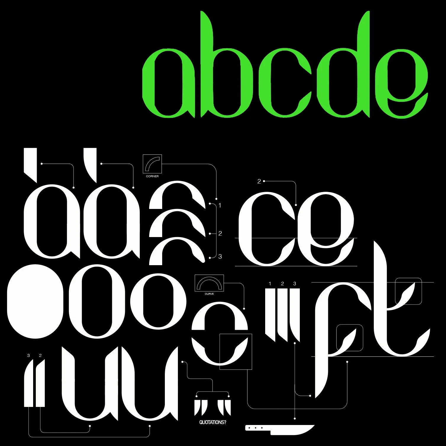
In this brief the intention of my final piece was to raise awareness for the Key4Life Brand and knife crime statistics in the uk for a young audience. The main outcome I create for this brief was an instagram story featuring a quote from a news article containing a thought provoking quote from the friends and family of a victim to knife crime. The was brought to life with a bespoke typeface I created paired with eye catching animation. You can watch the video below.
The typeface took form from an initial icon I created. The shape of a blade helped influence every letter of the alphabet and resulted in a striking and visually consistent outcome.
Simplistic shapes helped the readability of this font. This paired with unique edges to each letter helped to create a bespoke and unique design.
-
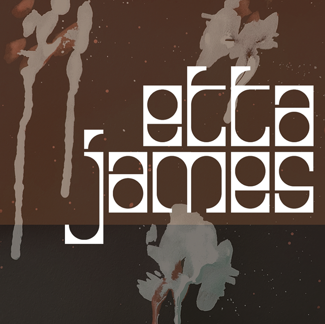
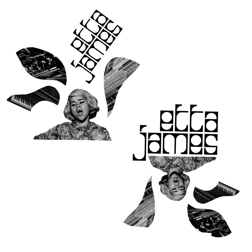
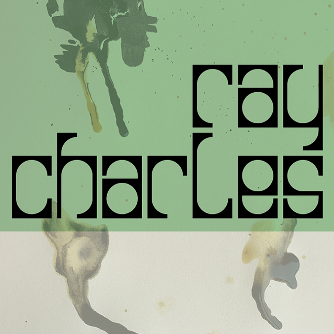
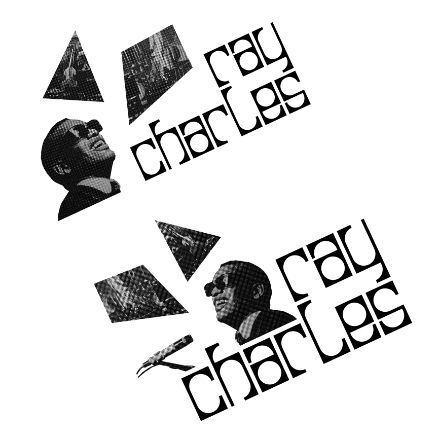
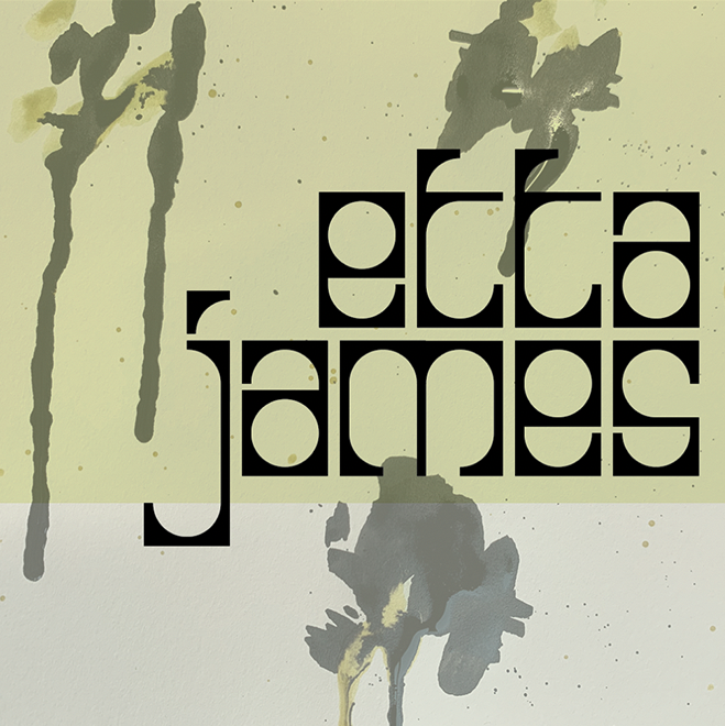
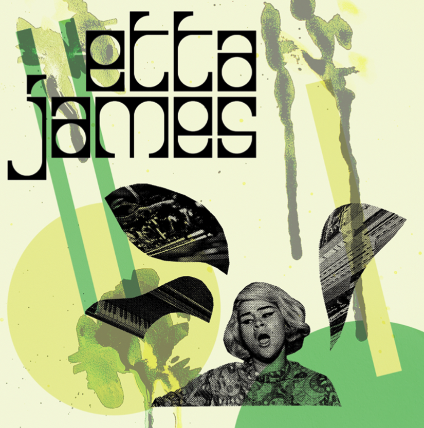
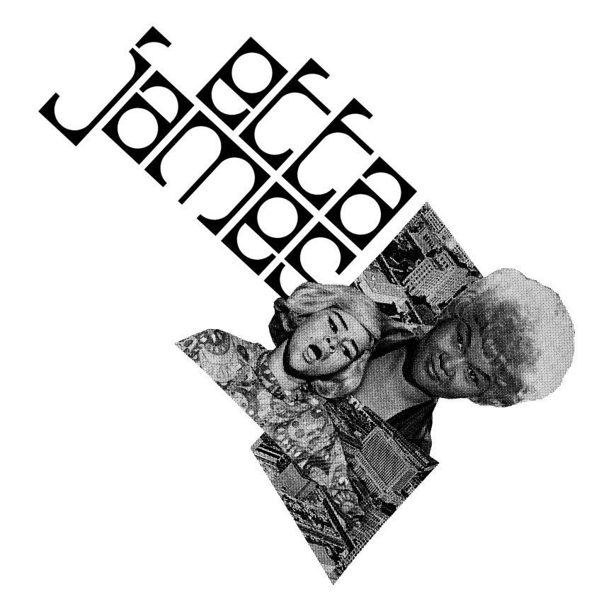
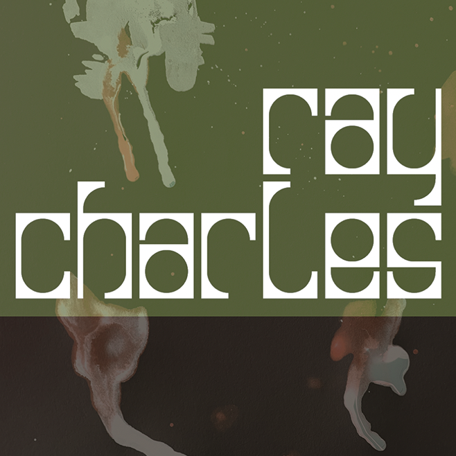
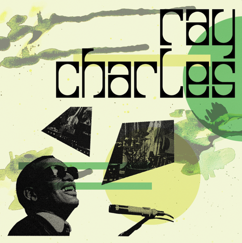
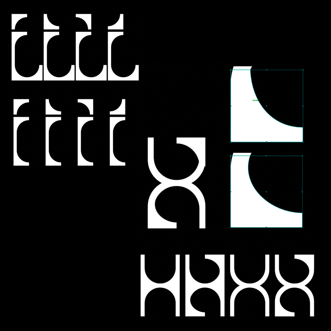
Inspired by the iconic music genre that is Jazz this typeface uses a loud and playful design much like the genre of music it was created for. The use of simplistic shapes and thick lines made it easy to read no matter what composition it was in resulting some very playful outcomes.
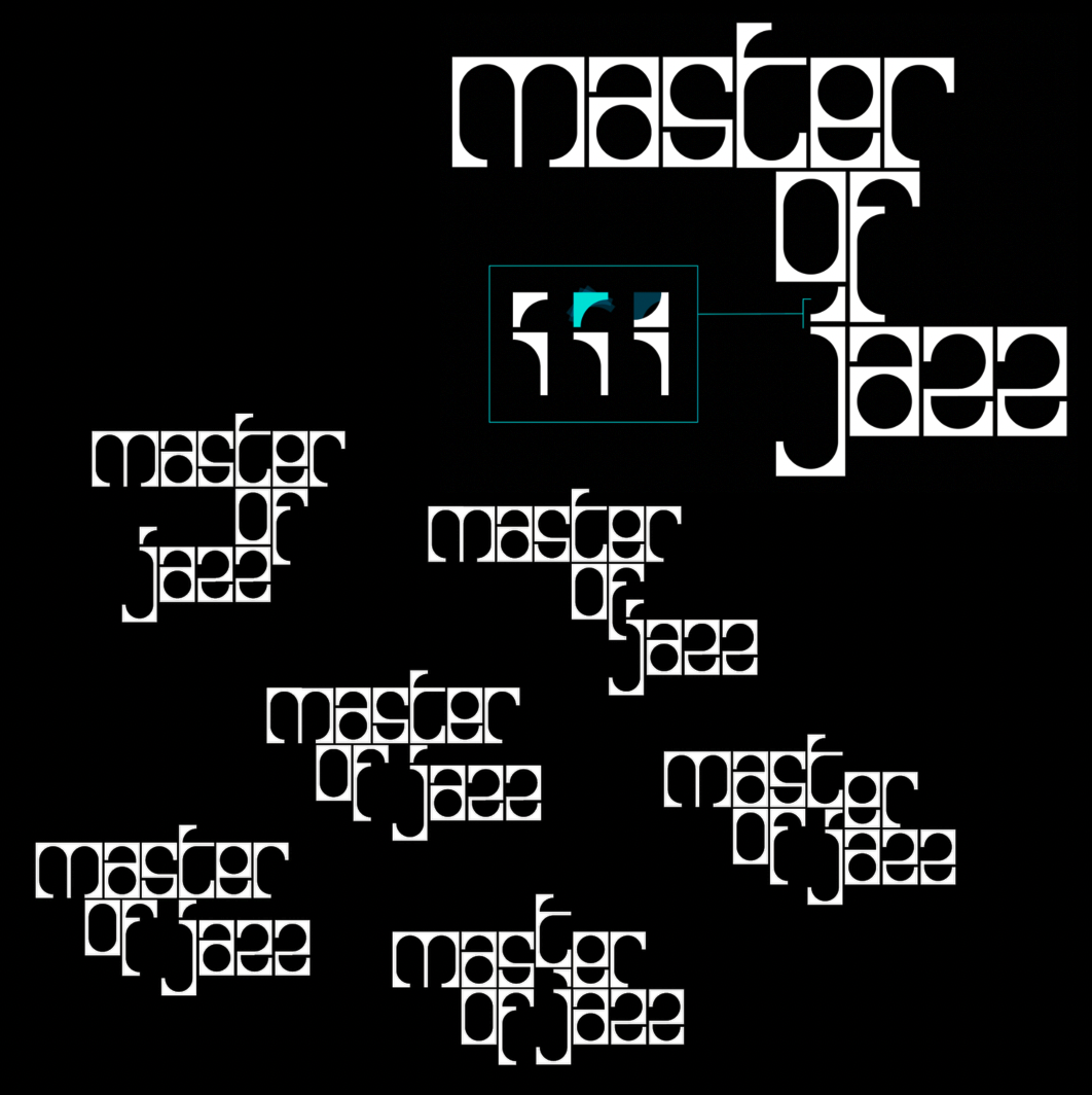
This typefaces block like exterior allowed for interesting arrangements of the letters. A consistent weight and size made for the designs to be fluent and consistent. The negative space within these letters also created new ways to position and format the designs to create new found shapes within the lettering.
